Your feedback on the new Moodle

Harry Kalantzis, Team Leader, Digital Education and Design Services, addresses the themes that students raised in the Moodle 4 survey.
After introducing Moodle 4 in September 2023, we asked students and staff for feedback on the new course structure. Many thanks to all the students who completed the survey, as we had a total of 365 participants, of which 281 (77%) were students.The survey showed:
- 179 (67.6%) respondents found their modules consistent or very consistent (scored 4 and above)
- 157 (59.3%) students found their modules easy or very easy to navigate (scored 4 and above).
Here is a summary of your feedback and how we are going to address it:
There’s no mobile app
Moodle has been developed to be mobile-friendly on devices using a browser such as Chrome, Safari, or Firefox, which means that it resizes appropriately and adapts to different screen sizes and works well on mobile when using a browser on iOS or Android.We appreciate it’s more convenient to have a phone app that allows you to access Moodle and the content and activities of your academic modules. But, unfortunately, not all the essential functionality for students (such as submitting to Turnitin) is supported within the mobile app. The app user interface is also radically different compared to the desktop version of Moodle, which creates an inconsistent experience and may confuse students. Regrettably, the mobile app remains unsuitable for Moodle at Oxford Brookes.
Increased scrolling in the academic modules
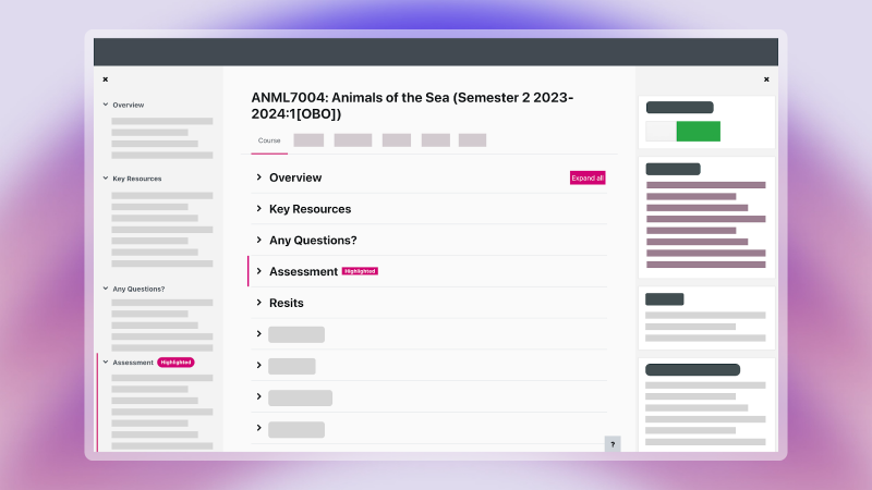
In July 2023, Moodle 4 introduced a new layout for academic modules in Moodle that presents content inside collapsible sections. This layout has been designed to reduce scrolling by reducing the amount of information that is visible at a given time when sections are collapsed allowing students and staff to dive in and out of the course sections by collapsing and expanding sections as required.We have also produced and shared guidance with lecturers that includes advice on how to structure the academic modules effectively and streamline their courses to reduce scrolling.
In the summer of 2025, we are also aiming to upgrade Moodle to the next version which will include features and visual changes to help reduce scrolling.
Skipping the Moodle Dashboard
Moodle 4 introduced a separate screen called ‘My courses’ to include the list of courses that a student is enrolled on, while the Moodle Dashboard is reserved for information from all the modules that you are enrolled on.We are actively working on a project to improve assessment in Moodle and ensure that any information from your modules shown in the Dashboard is accurate.
In the meantime, we have used the Moodle Dashboard to signpost existing University resources that can help you thrive at Brookes, including wellbeing support, academic guidance, and professional opportunities to enhance your learning, build your community or experience something new.
See all the deadlines in one single place
We are currently working on a project to streamline and automate the assessment in Moodle and will explore the possibility of displaying assessment information, including deadlines, in the Moodle Dashboard.Supporting lecturers with the use of Moodle
We currently offer training sessions for lecturers who use Moodle for teaching, at the beginning and during each semester.Background
Back in September 2023, all academic modules in Moodle adopted a new consistent course structure, making it easier for students to find what they want, as well as making content accessible for all. We called this structure 'Brookes VLE template' and we evaluated its short-term impact on the student experience with a survey that ran from December 2023 to January 2024.If you have any further feedback about Moodle or require help in getting the most out of Moodle, you can look at the resources below:
