Guidance for staff uploading or adding images to the website.
Accessible images and best practice
Images uploaded to the University website must be 72 dpi, medium quality and file size under 100 KB.
You should upload images as WEBP files. WEBP is a modern image format developed by Google as a replacement for JPEG, GIF and PNG. This allows for smaller file sizes at comparable quality. We are aiming to use WEBP where possible to support our digital sustainability goals. You can also upload JPEG, PNG and SVG files to the website. Only use SVG files for images that contain diagrams or charts.
Upload your image to the correct folder, if the number of images in the folder are moving towards the maximum of 100, please contact the Web Team with a web support request to create a new folder.
You should save your image with a descriptive file name, for example ‘buckley-building.jpg’ and not ‘bk-bldg-0065-01-12-2024’. This helps users find images to reuse. Do not use special characters or spaces in the file name. Use underscores or hyphens instead.
Avoid using a white background, add a light grey background or transparent overlay.
If the image provided to you does not fit the dimensions (i.e. 800 by 450 pixels), centre the image vertically or horizontally and add a blurred version behind the image (see figure 1).

Banner images
Banner images sit along the top of the page. We have several types of banners which require different image dimensions.
Top level banners should be cropped to 1200 by 440 pixels.
Secondary banners are mainly used on our other landing pages. The image for this banner should be resized to 930 x 350 pixels. This includes banners for Open Days, Events and Courses.
Research unit banners are used on research institutes, centres, groups and project pages. The image for this banner should be resized to 800 x 450 pixels.
Profile banners are used on profile pages. The image for this banner should be resized to 800 x 450 pixels.
Standard images
Standard images should be resized or cropped to 800 by 450 pixels. These are generally used within the main content of a page or for Profiles, News and Events pages.
Course images
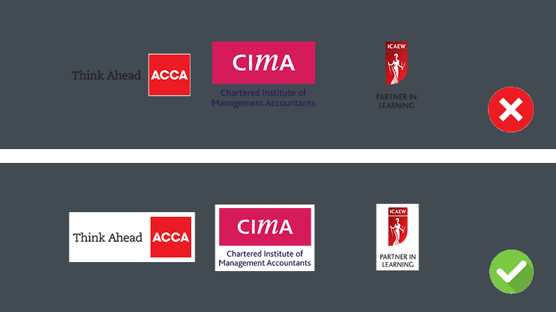
Course accreditation logos should be 96 pixels high and should have a white background with at least 5px spacing . Dark text on a white background is easier to read (see figure 2).

Avoid uploading images that contain text unless they are logos, please upload an alternative image. Text in images cannot be read by assistive technology. Also, text can often be pixelated and can be hard to read.
All non-decorative images must have alternative text (alt text). This will be read out to people who cannot view images or use assistive technology.
- If the image is purely decorative and adds no useful information to the content you can leave the ‘Image Alt Text’ field blank. The image is ignored by assistive technology.
- If the image is meaningful and includes useful information, you must add a brief description in the ‘Image Alt Text’ field.
You should write alt text as if you are describing an image to someone over the phone. Try to use the maximum of two sentences for alternative text.
Avoid using the words picture, image , photo, etc. as this information is redundant.
Images that are complex or require additional context should include captions.

Bad alt text: Student
OK alt text: Student writing
Good alt text: Student writing notes with coffee

Bad alt text: Art
OK alt text: Art on a wall
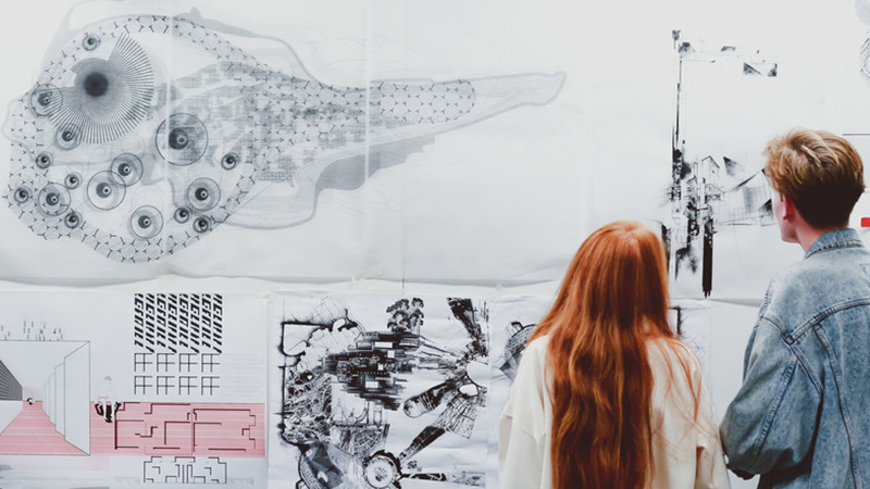
Good alt text: Two students viewing designs pinned on to a wall
